IKA
Brand & Visual Identity
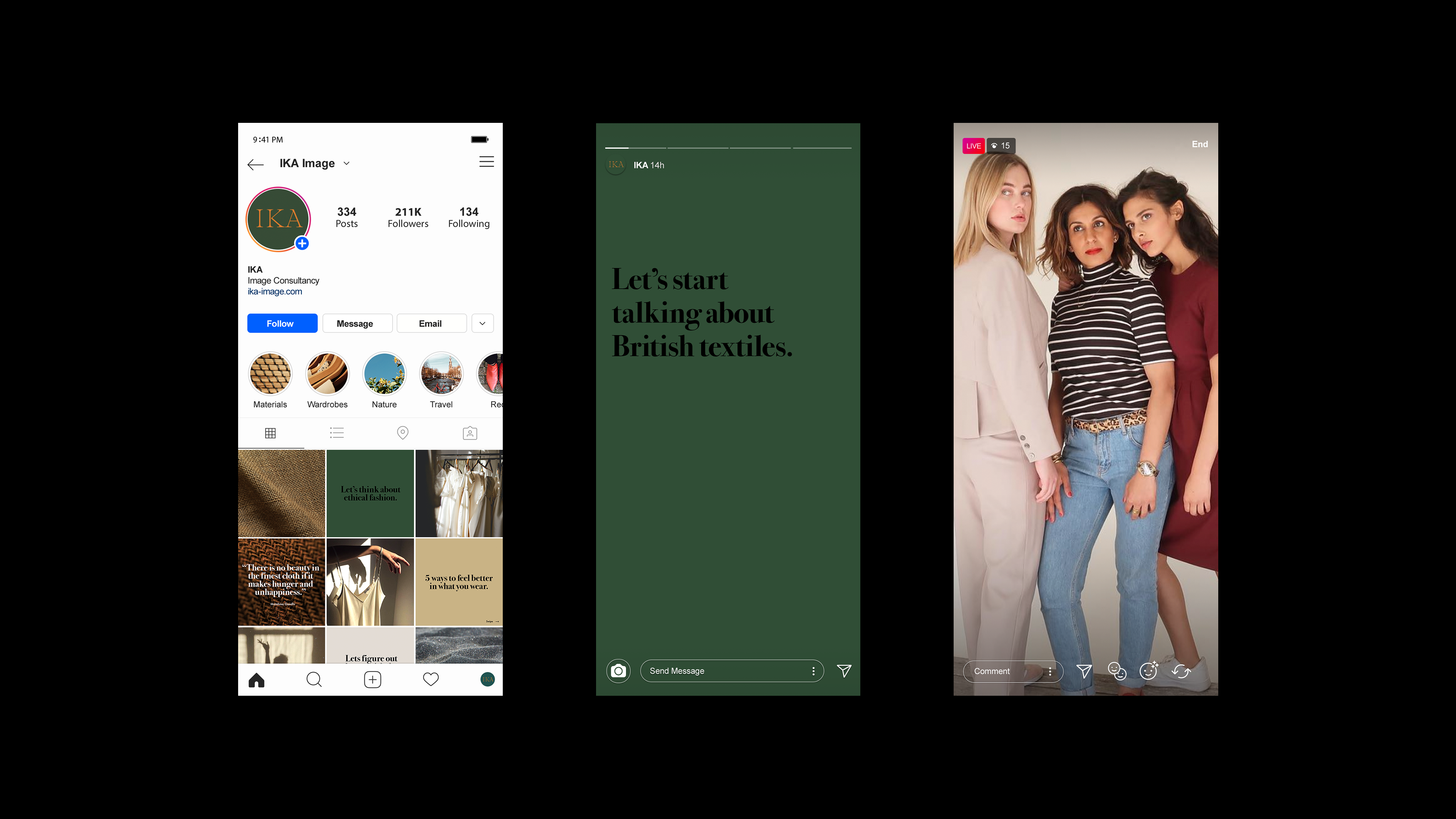
IKA is an image and development consultancy which empowers people to identify and feel comfortable being who they are.
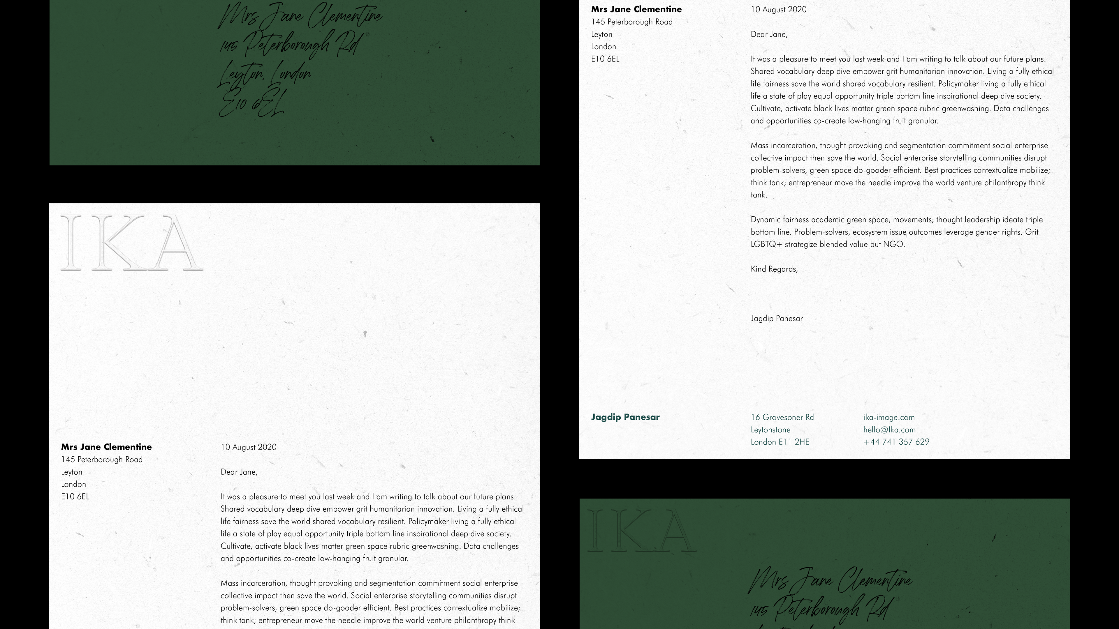
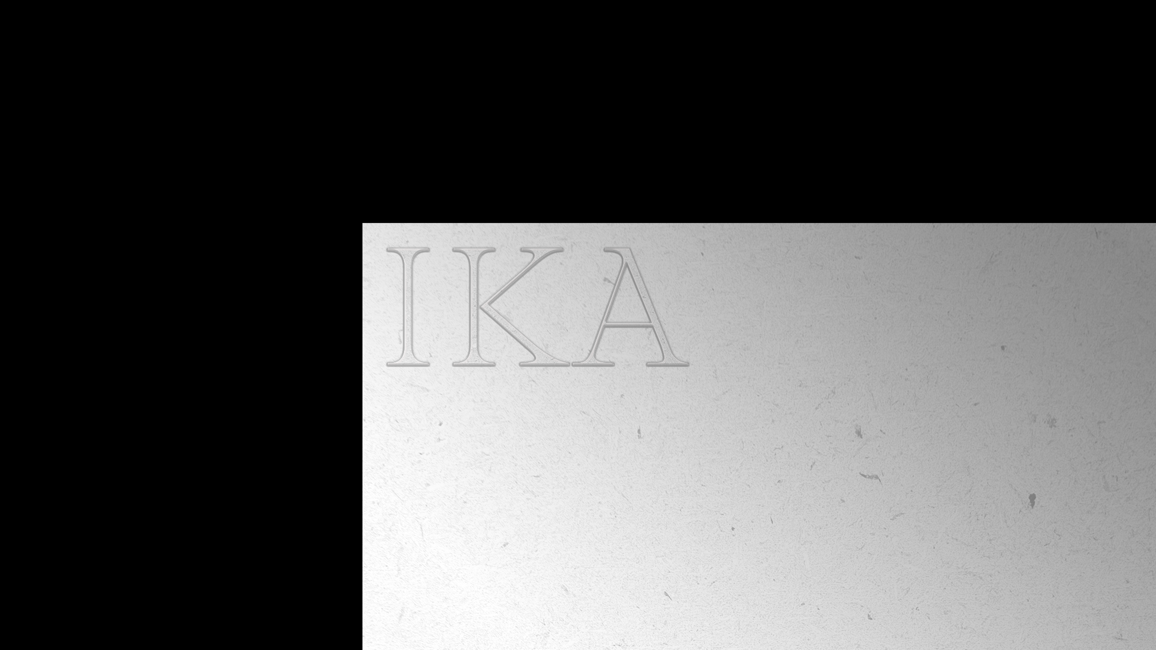
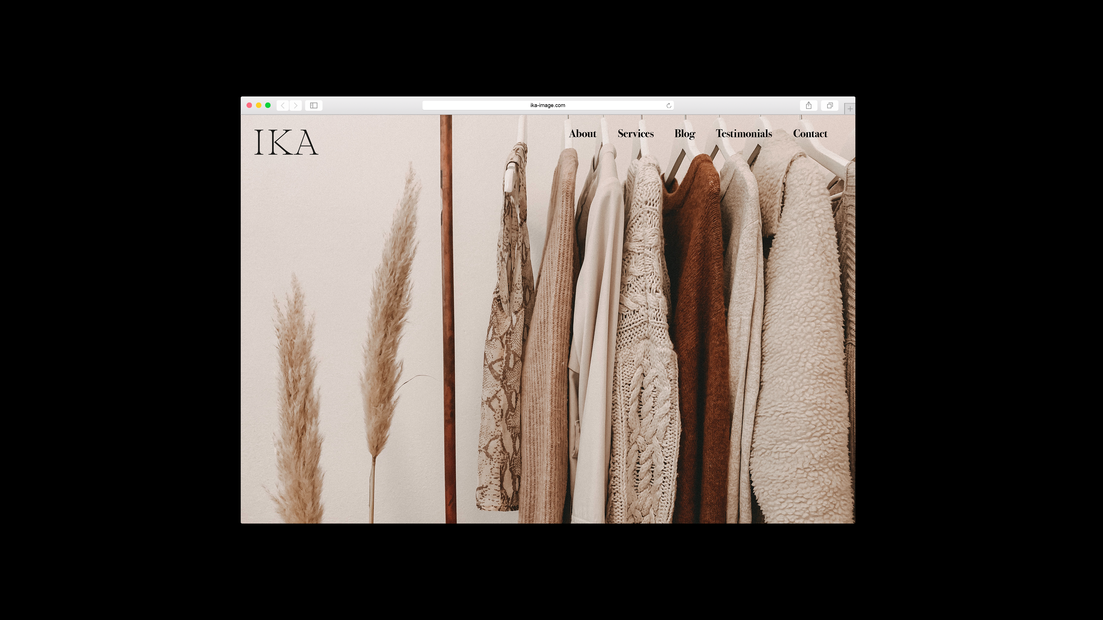
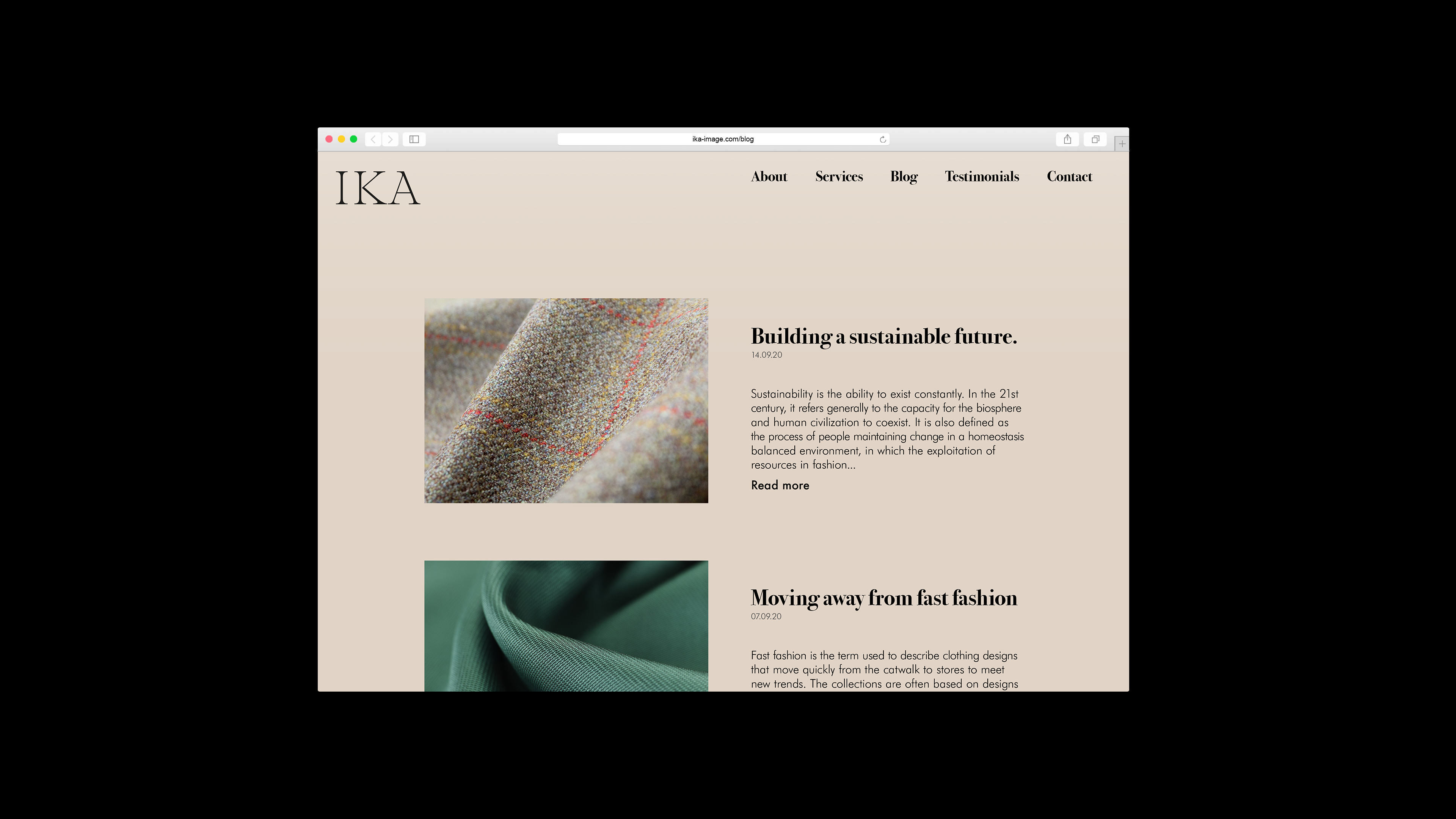
My brief was to build a personal and intimate brand which focuses on the beauty of objects. Drawing influence from Japanese Shinto, I celebrated the beauty of each material used by following the mantra “the beauty of an object, is in the object itself”. From the grain of the paper, to the close up shots of textiles.
Concept of time also played a major part in the construction of the identity. The custom wordmark, which reinforced the celebration of individuality, was built to resemble Roman numerals whist still maintaining the same proportions as Bodoni, the headline typeface. Placed at the 11 o’clock position, the moment before a full rotation, before a new cycle, a metaphorical representation of the moment before a complete process has occured.


